Cloud Phone
UI & UX design guidelines
Updated: Mar 12, 2026
Introduction
Cloud Phone is a cloud-based phone platform allowing users to access popular web services on feature phones. Developers can create cross-platform widgets using web technology compatible with various feature phones.Ensuring a seamless, user-centered experience is vital for the success of any widget. These guidelines provide valuable insights on creating widget icons, optimizing layouts, and aligning typography with Cloud Phone's aesthetics and UX standards. Following these principles will enable your widget to integrate with the platform while preserving its unique identity.
Widget icon
Widget icons serve as the first point of interaction between users and your widget. With feature phones, simplicity is key. Designing a memorable and intuitive widget icon will attract viewers towards your widget. In this section, we delve into the art of creating widget icons that are eye-catching and easily recognizable on small screens.
With effective icon design, we can ensure user recognition and smooth widget navigation.
Improve user recognition by focusing on a central concept that embodies your widget's essence and crafting a clear, distinctive icon. Avoid excessive details that may become unclear, especially at low resolutions like QQVGA.
Size & shape
To provide a consistent and visually appealing user experience, Cloud Phone has specific requirements for widget icon size, shape, and design.
Each widget must provide a baseline icon of 512 x 512 pixels for use in the all-widgets grid and list views of Cloud Phone, as well as throughout the platform once the widget is installed.
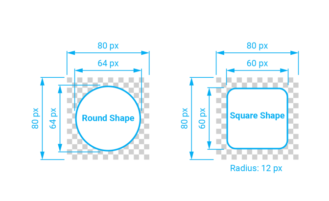
Widget icons are square, and the system applies masking to produce rounded corners. Provide an appropriately shaped, unmasked image, as the system masks the image edges to produce the icon’s final shape.
Concise widget icon style
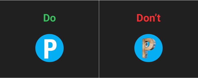
Use solid colors with minimal embellishments for all elements.
- We recommend designing a simplified graphic that emphasizes key features instead of using a photo.
- Photos, with their intricate details, may display poorly on low-quality screens.
- Overly detailed icons can pose consistency issues on feature phones when integrating 3D designs and shadows.
Icon transparency
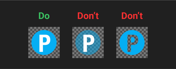
Avoid using a transparent widget icon and background color; it can make it difficult to distinguish the icon from the wallpaper.
Layout
Effective layout design is crucial on feature phones due to limited space. The following strategies organize content and navigation elements for a seamless, intuitive, and engaging user experience by maximizing screen space.
Header
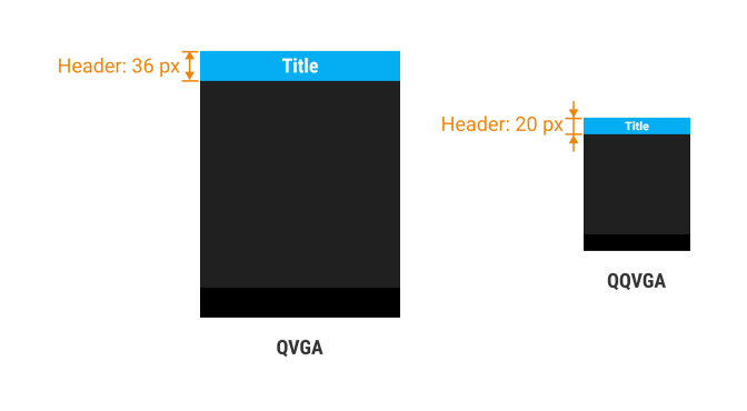
A header appears below the status bar. The text in the header is centered and displays the widget name or title.
Software key
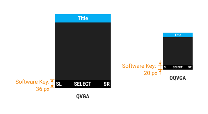
A software key is a customizable button or virtual key within the phone's interface. It compensates for limited physical buttons, allowing users to personalize functions. Users can configure these keys through the phone's settings, tailoring the device to their preferences.
The software key appears at the bottom of the screen, corresponding to the center, right, and left hardware keys. The presence of each key may vary based on feature availability.
Under specific conditions, using an icon for the center key is permissible, provided it is universally recognized, such as a play or pause icon.
Margins
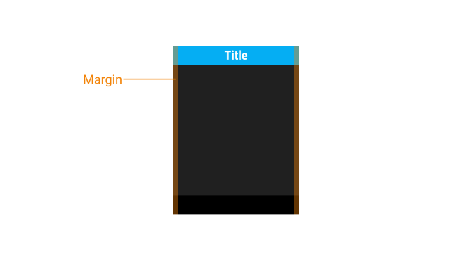
Margins are the space between the content and the left and right edges of the screen.
Margin widths are determined using fixed or scaling values within each breakpoint range. To optimize adaptability to various screen sizes, margin widths can be adjusted at different breakpoints. Wider margins are better suited for larger screens, as they provide more white space around the content's perimeter.
Typography
Typography is the backbone of user experience on feature phones.
Given limited screen space, selecting appropriate fonts and sizes becomes critical for readability. In this section, we'll explore primary typographic principles designed for small screens. Mastery of these principles ensures that users can navigate menus and access information with ease, ultimately improving overall usability and satisfaction.
Typefaces
Utilize font weight and size only to highlight essential information within your widget.
Roboto
Cloud Phone uses two weights of Roboto (regular and black).

Font sizes
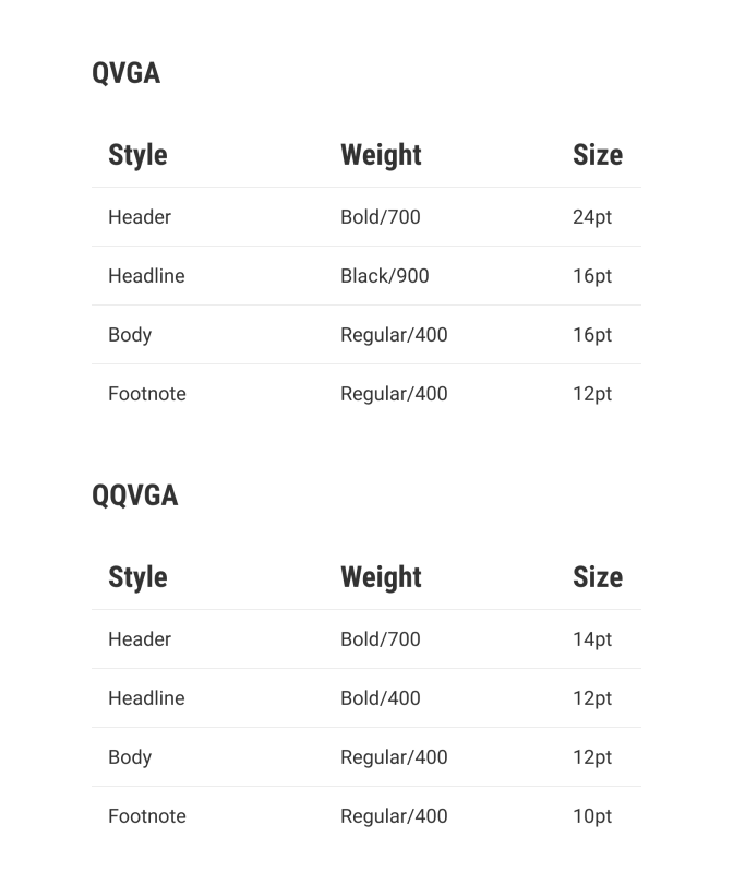
Cloud Phone uses a predetermined range of font sizes, carefully calibrated to emphasize the importance of content while ensuring readability.
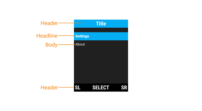
Below, you will find a list of frequently used styles and necessary components you might need. These encompass four preset styles tailored for displays featuring QVGA and QQVGA resolutions.
User feedback and response
User feedback tells us about their experiences and needs. Responsive interactions ensure that their voices are acknowledged and addressed. Below, we explore the process of harnessing feedback to improve designs and providing timely responses to boost user confidence and engagement.
- Responsive Feedback: Provide immediate feedback for user actions. Use subtle animations, vibrations, or sound cues to confirm button presses.
- Error Handling: Clearly communicate errors with simple, easy-to-understand messages. Offer guidance on how to resolve issues.
Performance optimization
Performance optimization is critical for feature phone usability. Streamlining code and minimizing resource usage ensure that every user action, from button presses to menu navigation, is smooth and effortless. Let's uncover the essentials for crafting feature phone software that delivers unparalleled user satisfaction.
- Efficient Coding: Write clean, efficient code to optimize software performance. Feature phones often have limited processing power, ensuring smooth operation.
- Minimize Data Usage: Design apps to minimize data usage, considering users with limited data plans.
Testing and iteration
Outstanding feature phone design is founded on the principles of testing and iteration. The former provides insights into user behaviors, while the latter refines our designs based on real feedback. This section delves into the iterative process of transforming good designs into exceptional ones. Through continuous adaptation and enhancement, we craft feature phone interfaces that prioritize intuitiveness and user-centered design. Let's embark on this journey to perfect our user experience.
Real user testing: Conduct usability tests with actual feature phone users. Gather feedback and iterate on the design based on user experiences.
Continuous improvement: Regularly update the software based on user feedback and evolving technology. Embrace user-centered design fundamentals for ongoing enhancements.
By adhering to these guidelines, you can create feature phone software that provides a seamless, intuitive, and enjoyable user experience.